This post is on my method to create an icicle chart on Tableau. I have used this in my submission for #vizforsocialgood for Foundation Follereau Luxembourg. Click here to see the viz submission. Initially, I have thought that I am innovating a new chart type, but I have realised that it is an existing chart called icicle chart after publishing. You can see Adam E McCann's Tableau version here.
Step 1: Create First Bar Chart
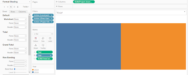
- Drag the value to Columns (first picture below).
- Drag the pill that you will like to split the chart by into Colour as Discrete, in this case, it is "Year".
- Right-click on the chart and click Format. Click on the "paint tub". Click on the field beside Worksheet and choose "None" to make the background transparent (second picture below).
Step 2: Create the Second and the Other Bar Charts
- Duplicate the Sheet.
- Drag the value to Columns.
- Drag the pill ("Year") from the first bar chart as Discrete into Column and Colour.
- Drag the pill for how the 2nd chart is supposed to be coloured into Colour as Discrete.
- Repeat for the rest of the bar charts. See 2nd picture as reference.
Step 3: Drag the Sheets into Dashboard
- Publish your viz first and do this step on the browser itself to have a better grasp of the alignment and scale.
- Using the Floating function under Dashboard, drag the first bar chart to anywhere you want and re-size it to your desire (see the first picture below).
- Do the same thing for the 2nd bar chart and the rest of the bar charts by using the Size and Position provided on Layout to help you align and stack the bar charts neatly (see second and third picture below).
Step 6: Publish Your Icicle Chart!
P.S. With the same idea, a ridge plot may be possibly implemented in Tableau.


