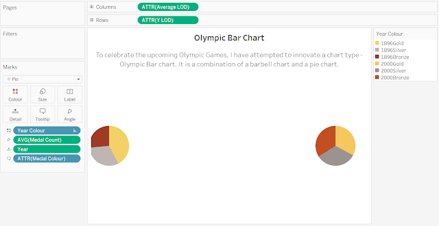
With the Olympic Games scheduled to happen in Tokyo in July 2021 as of this writing, I have decided to try to innovate a new chart type about the Games. Inspired by the Olympic bar used for weightlifting (pictured below by an image from Wikipedia), the Olympic bar chart is a combination of a barbell chart and two pie charts. It shows not only the change in value over time like a barbell chart, but it also shows the proportion of the items within, similar to a pie chart. In short, this chart inherits both the pros and cons of the barbell and pie charts.
You can check out the chart on Tableau Public here. In this post, I will write about how to create the Olympic bar chart on Tableau.
Step 1: Set up the Data
- For the chart to work, set up the data something like below.
- Besides the usual data, you need column "Y" to specify where the line and pies are drawn, and the column "Year_Colour" to label the colours of the pie charts' segments.
Step 2: Create Calculated Fields for X and Y using Level of Details (LOD) Expressions
- This is an important step for the pie chart to work and is borrowed from a step to make a combination chart of scatter plot and pie chart in Tableau.
- You may read more about LOD Expressions here.
- In summary, FIXED level of detail expressions compute values using the specified dimensions without reference to the view level of detail—that is, without reference to any other dimensions in the view.
- For "Average LOD", {FIXED [Year]: AVG([Total])}
- For "Y LOD", {FIXED [Year]: SUM([Y])} - you can use AVG, as it does not matter in this case.
Step 3: Create the Pie Charts
- Drag "X LOD" and "Average LOD" into Row and Column respectively, and make them into Attribute.
- Drag "Year Colour" into Colour.
- Drag "Medal Count" into Angle, and make it AVG.
Step 4: Create the Line Chart
- Duplicate "ATTR(Average LOD) in Columns.
- Make the chart a line chart.
- Make it "Dual Axis" and "Synchronise Axis".
Step 6: Publish Your Olympic Bar Chart!
- Add in the labels.


