This post is my method for creating a thermometer chart on Tableau. I have yet to see this method being taught or used by many. For other methods, you may visit Toan Hoang's blog here or Data School's blog here by Andrew Lehm. Toan Hoang's method requires formulas and creating bins, but it looks neat. Andrew Lehm's method is simple using bar and circle charts, but the thermometers do not end up with a rounded end. My method requires some editing in Excel (or whatever software you are using to edit your data) and it uses line and circle charts in Tableau. For a closer look beside the picture above, you can click here to see my version on Tableau Public.
Step 1: Create the Data
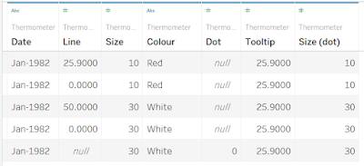
- Pictured below, you need at least 5 rows and 5 columns (ignoring the "Date" and "Size (dot)" columns) for a thermometer chart.
- Row 1 is the temperature of your data. In my case "25.9", so have in under column "Line" - named for easy reference when creating the chart.
- Row 2 is "0" so that the line know where to start in Tableau.
- Rows 3 and 4 are for the white container of the thermometer. It will be another line chart. They are differentiated from the above 2 rows with the "Colour" and "Size" columns the size will later determine the size of the line chart and the colour will be the "glass" and "mercury of your thermometer".
- Row 5 is for the circle that makes the base of your thermometer. Keep the "Line" column empty and fill in the "Dot" column as "0".
Step 2: Format your Worksheet
- Turn your worksheet black to see the white colour of the chart clearly and remove all lines (pictured below).
Step 3: Drag "Dot" to Rows
- Drag "Dot" to Rows and change it to "Dimension".
- Change the Mark type to "Circle".
Step 4: Drag "Line" to rows and make it Dual Axis
- Follow the steps like Step 3 for "Line" but change it Mark Type "Line".
- Right-click on "Line" and make the chart a Dual Axis.
- Right-click on the header and Synchronise Axis (pictured below).
Step 5: Change Colour
- Change colour to "red" and "white" or any colour you want your thermometer to be (pictured below).
- A tip to change colour for Dimensions quickly is to double-click on the colour tile and select the colour straightaway instead of using the given groups of colour templates.
Step 6: Size it Up
- Drag "Size" to Size under Mark Type "Line" and turn it to "Dimension" (pictured below).
- Adjust the sizes to your liking
Step 7: Edit Tooltip
- Drag "Tooltip" into Tooltip (picture below).
- Clean up your tooltip so that no matter which of the charts users choose, they will see the same temperature.
Step 8: Publish Your Thermometer Chart!
- Check out one of the times I have used the thermometer chart below and click here to see it on Tableau Public.


