As noted in my last post, I look out for charts in various media to find inspirations for my viz. In addition to the Economist, I browse National Geographic for ideas. Compared to the Economist, the vizzes and charts in National Geographic are more design-centric to bring light to the issue of concern. Admittedly, besides visualisation skills on Tableau, some design elements from other software may be needed to create vizzes like National Geographic.
Below are the 3 vizzes that I have found compelling enough to make note of:
1. The High Price of Heat from Issue Jul 2021
In my opinion, this comet chart from this viz is different from the other vizzes on temperature and climate change. Without the red-green colour gradient is typically used, the comet chart still shows the extent of the changes in temperatures and their effect clearly. The effective use of white space is something to take note of.
2. Disappearing Sharks from Issue Aug 2021
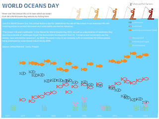
This design is a brilliant execution of what I have wanted to do for a marine-related viz. Compared to my viz (picture below) that I have created for World Oceans Day before coming across this viz, this viz is a winner. The use of slope charts against a horizontal axis on the size of sharks groups the sharks nicely. The colours of the slope charts that adds another layer to the visual story is also a new technique to me.


