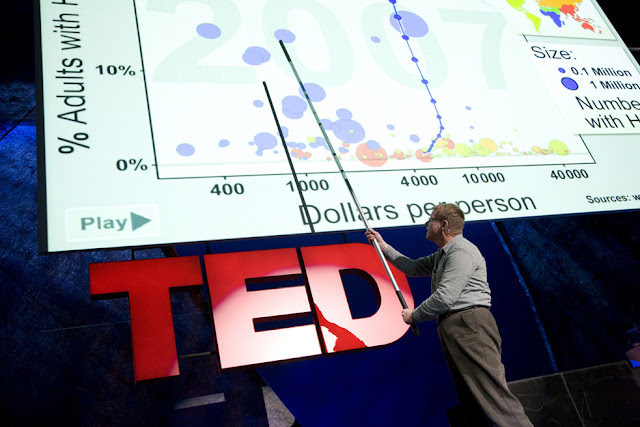
Hans Rosling has been described as a data visionary by TED. "A presentation that tracks global health and poverty trends should be, in a word: boring. But in Rosling's hands, data sings. Trends come to life. And the big picture — usually hazy at best — snaps into sharp focus." The 10 TED talks he had done exemplified how simple charts can be made outstanding during presentations, like a commentator narrating what is happening on the field or court. You can find his 10 TED talks on his TED profile page or his playlist. In this article, I will be focusing mainly on the data viz parts of his presentations. Pictures in this post from his TED talks.
1. The best stats you've ever seen (19:37)
His first TED talk. A legendary one. He told a story on world development with an animated bubble plot that earned him a standing ovation from the crowd. I never thought that an animated bubble plot can be so interactive until I have seen his presentation. If I were to debunk the myth that a humanities subject cannot be mixed with numbers, this would be the video to show. An example of his chart presentation can be seen in the picture above the opening paragraph.
2. New insights on poverty (18:45)
The first half of the presentation is a demonstration of the Trendalyzer software developed by Hans Rosling's Gapminder Foundation. By isolating data points, Rosling was able to tell changes over time on the bubble plot compared to other data points.
3. Insights on HIV, in stunning data visuals (9:43)
The discussion on the over-simplification of the developing world can also be seen as a lesson for us on seeing dimensions of data than just blindly visualising them without realising the full story.
4. Let my dataset change your mindset (19:40)
Once again, Hans Rosling shows how a bubble plot can be used to highlight changes, despite the scatter and bubble plots not being used like this. A takeaway for anyone who thinks that such charts lack the aspect of time.
5. Asia's rise - how and when (15:33)
A focus on India's and China's catch up using the bubble plot. With this being his 5th video, you would already know what Rosling would talk about. However, one thing I noted is that he predicted India's and China's income per person with caught with the likes of the United State on 28 July 2048 on his 100th birthday and wished that he would still be giving a TED talk. Sadly, Hans Rosling passed away in February 2017. The videos had been inspiring as data viz come alive in front of audiences from different parts of the world.
6. Global population growth, box by box (9:47)
A different method of visualising data. This time, Rosling used a unit chart that was built from real boxes from Ikea. It is a masterclass on how to bring fresh data viz content to the audience while expanding the same topic.
7. The good news of the decade? We're winning the war against child mortality (15:18)
The video starts with the measurable millennium goals and moves into surveys by the United Nations at 3-year intervals to collect the data. It then dwells on trendlines with a signal that the world is winning the war against child mortality on the idea that the results are better than predicted. The presentation also once again brings up the idea that looking at the world as "developing" and "Western" is wrong as the bubble plot shows why using time and grouping of data.
8. The magic washing machine (8:59)
A refreshing take on electricity usage using a unit chart. (Note: green means tapping onto a renewable source)
9. Religions and babies (13.04)
Using the bubble plot, Rosling suggested that religions have no effect on babies per woman. Instead of Ikea boxes, cardboard boxes were used to illustrate the move to 10 billion people on the planet. Perhaps, a video made interesting by the audience noting the presentation was given in Doha, Qatar. Once again, it shows how the audience affects the storytelling of data.
10. How not to be ignorant about the world (18:56)
A joint presentation by Hans Rosling and his son, Ola Rosling. Combining data viz and live polling with the audience, Hans Rosling made data viz interactive again.
All in all, the series of TED talks by Hans Rosling is not be missed if you are keen to see how data viz can be presented in a lively manner to a live audience. A data viz with a story is interesting. A story not told is unheard. A good storyteller captivates the audience and not does lose the plot.


