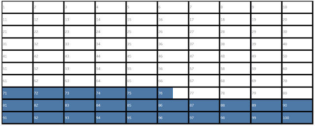
This tutorial will be on how to create a waffle chart on Tableau. Most preparation will be done on Excel or software that you are comfortable with populating a table. A quick search with the keywords "waffle chart tableau" will lead you to various websites quickly. However, I have used a different method for my #MakeoverMonday 2021 Week 34 submission (hyperlinks to versions 1 and 2). This method is good because the waffle charts can be re-sized in Tableau without gaps or cramping the waffle holes (pictured below). However, I have not found a way to include more than one category in the waffle chart using this method.
Step 1: Input Data
- I have done this using Excel.
- Create a column 1 to 100 for the waffle hole.
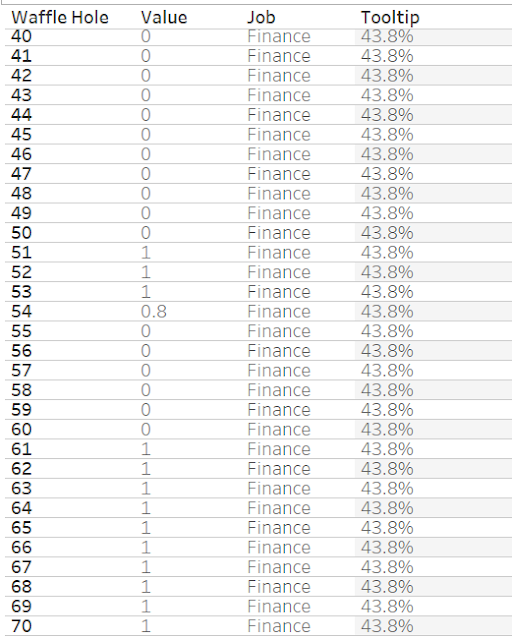
- Create a column with 0 to 1. With 1 meaning the hole will be filled and 0 not. Using decimals like 0.2 will mean the waffle hole will be filled precisely to the decimal point of %. Pictured below is an example of how you should input your data and where each waffle hole is based on the number given. Start the 1 from 100, so the waffle chart will start the colour from the bottom.
- Create a column for filtering, if needed.
- Create a column using the value of the % for tooltip.
Step 2: Filter, If Needed
- Filter the item you are visualising in this waffle chart.
Step 3: Create Calculated Field for Small Multiples
- Create Calculated Field for columns and rows.
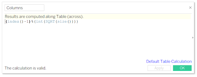
- This is the formula to create small multiples (pictured below).
- Row: int( (index()-1)/(round(sqrt(size()))))
- Column: (index()-1)%(round(sqrt(size())))
Step 4: Create the Small Multiples
- Drag the Column and Row pills into column and row respectively.
- Drag Waffle Hole pill into Detail under Marks (1st picture below).
- Ensure that the pills are Discrete.
- Change the Column and Row pill to Compute Using Waffle Hole (2nd picture below).
- Turn the Marks Type to Bar.
- Add 1 to Continuous "AVG(1)" to columns and Discrete "AGG(AVG(1))" to rows.
- Drag the value (i.e. 0 to 1) pill into columns
- Make them Dual Axis and synchronise the axis.
- Turn the axis to a fixed axis showing 0 to 1 (1st picture below).
- You will get the 2nd picture below.
- Max out the size of the Bar (1st picture below).
- Change the colour to whatever you want your waffle flavour to be (2nd picture below).
- Format the Pane under Row and Column Divider for the border of each waffle hole.
- Right-click on each pill to uncheck Show Headers.
Step 8: Publish Your Waffle Chart!


