Q: What is maximising data-ink?
A: From Edward Tufte's book, The Visual Display of Quantitative Information:
Tufte has also provided examples using a bar chart, box plot, and scatter plot. An example of the bar chart can be seen below to better illustrate the above point:
As stated in the title, I have made 3 attempts to see if I can bring the concept further and onto other chart types. As a caveat, the following are experiments on the concept discussed and are not intended to be best practices.
1. (Column) Bar Chart
Original (from Wikipedia):
My Attempt (using 2 of the values as an example):
Taking the concept to the "extreme", the bar chart has almost become a line/sparkline chart line with no movement along the line. In some sense, the skeleton of the chart do still allow readers to understand, but the thin bars may not have been able to draw attention. Additionally, the thin bars may either lead to too much white space on the chart or result in the chart being too crammed if the creators close up the gap between the bars. However, I think that keeping the numbers help readers identify the values quicker.
2. Candlestick Chart
Original (from Wikipedia):
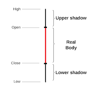
My Attempt (green for rising, red for fall):
The result is quite similar to the box plot by Tufte in some ways. It may work in the sense that the critical components are still kept except it no longer looks like a candle. The lack of a thicker centre may make each body hard to recognise at a glance besides using the colour as an identity. The shadow may also be mixed up without the colour. Even if colour is added to the shadow, the open and close become the divider that may be too thin to help distinguish the real body quickly.
A simple erasing of the axis and marks, and use of the empty space between the headers and dots as the zero line. This attempt may be the most successful but the least inspiring and innovative way of data-ink maximisation of the 3 attempts. In a way, it works the best and can be applied easily.


