For this tutorial, I am going to show you how I have done the Radial / Circular Bar Chart for my #DiversityinData submission for June 2021. I have not seen this method being used extensively, but there are some caveats. First, you will need to set up the data in Excel. Next, it may be tedious as you the chart layer by layer. Lastly, the chart size is hard to control as it is created using Marks layers. Each layer is a pie chart with 2 halves - 1 coloured and 1 in white to hide the white part of the pie chart.
I do think that a radial bar chart makes more sense for data in percentages with one full round equaling to 100%.
Step 1: Set up the Data
- Go to Excel or any way you use to set up your data.
- Below is the explanation for the setup for the non-mathematical part:
- The country column is for activating the Marks Layer function in Tableau. A new function was added in Tableau 2020.4.
- Columns G and I are for the labels or tooltips.
- Column H is for identifying the colours. You can use the names of the colours you want as replacements.
- For the mathematical part:
- Columns B to F will be each of the layers. They are percentages to determine how much of the pie charts shall be coloured (i.e. 100% = 360°, 75% = 270° 50% = 180°, 25% = 90°etc.). Remember Tableau pie charts start from the 12 o'clock position.
- To get the percentages, I used 75% as the maximum value. I then used the biggest "Number of Events" which is 18. I take 18*x=0.75 to find x. Subsequently, I took the "Number of Events"*x to find each percentage.
- Row 7 is also the percentages. They are 100% minus the first percentages of the column. They will be the white space that you are going to have.
- Go to Tableau.
- Just like how you will create a map, drag the country the Longitude and Latitude into Columns and Rows and "Country" into Colour.
- Go to Map and then Map Layers (first picture below).
- Put Washout to 100% and uncheck all the boxes (second picture below).
- Change the type of Marks to circle.
- You can change the colour to white since the centre of the radial chart is empty. For how to get the white colour or other colours, you can click here to find out.
Step 2: Create the First Bar
- Drag "Country" out. This time it will activate the Add a Marks Layer function. Drag and drop "Country" into it (first picture below).
- Leave "Country" in Details (second picture below).
- Drag and drop "Colour" into Colour.
- Drag and drop Column B into Angle (in this tutorial it will be "70s").
- Adjust the size using the bar under Size (third picture below).
Step 3: Create the Subsequent Bars
- Using the same methods in Step 2, create the next Mark Layer.
Step 4: Change Settings under Colour
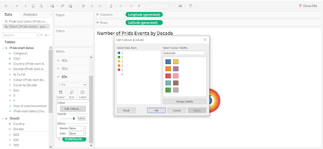
- Update the colour under Colours to the ones you want.
- Set Border and Halo to "None".
Step 6: Publish Your Radial / Circular Bar Chart!


