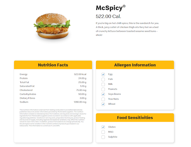
Continuing on the theme of food and menus, I have decided to reimagine the McDonald's menu, specifically, the McSpicy on Singapore's McDonald's website which I have also screenshotted above. I want to incorporate data viz and info visual elements to the menu, so I have used PowerPoint to come up with a prototype or sort below:
First, what I have added is a burger chart of the ingredients. This will help people identify what is in the food item, especially those with dietary preferences. Second, I have added a unit chart for the calories to remind people of their daily intake and how much more they can take. This is the same for the sodium intake but with a bubble chart. A rounded bar chart is created for the other nutrition facts to help highlight the numbers. Icons are used for the rest of the information to save space and allow people to see the information quickly. Nevertheless, icons can be misleading without labels.
All in all, this is a fun activity. It has also led me to think about how design can be a topic for me to discover and create better visualisations.
