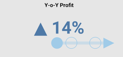
While reading Visualizing Health and Healthcare Data, I have come across the following chart, called the Single Point Shape chart. The chart has an arrow running across a line and another line cutting across it. I do not think that the chart has been specifically elaborated upon in the book. It is unknown if the arrow is meant to change direction if it passed the vertical target line (i.e. State: 13%).
It has caught my attention because I have a similar chart for my viz on BANs. That viz has been favourited 4 times, 4 higher than my usual. However, I have no idea why. Perhaps, the designs of the 7 BANs charts or the colour scheme. Or maybe it is the following chart that I think stands out among the rest of the design:
This idea of a "Multi-Shape Points" chart is not entirely new. The design I have is based on the following charts by Adam E McCann's KPI Options viz - Bar Bell Arrow and Dot Distro charts.
Inspired by reading Visualizing Health and Healthcare Data, I have decided to look at the Multi-Shape Points Chart again. I want to make it better. I want the differences between the starting point and the rest of the points to stand out more. Hence, the following attempt:
I then want more differences among the rest of the points. I want to show a passage of time on the line - a timeline but not in the traditional sense. I, therefore, turn to the colour gradient. One way to read the following chart is that the points go from lighter blue to darker ones.
On second thoughts, a gradient may be hard to tell when they are jumbled all about. Thus, I have one in different colours.
All in all, this has been an engaging exercise. Looking back at a chart I have done and adding to it with concepts I have learnt over the years, I have come to realise revisiting my own work can value-add to the work.


