This is a tutorial on what I have decided to call a Bar Bump Chart. I have a hard time finding tutorials online for it due to the lack of an official name. I have found Toan Hoang's tutorial here on a rounded version. My version requires no Calculated Field at all. It is a dummy method, but it may be unrefined in that sense as Tableau is not meant to be used in this way. It also seeks to solve the "issue" of using area (Size Marks in Tableau) to represent values as the expansions in all directions make it hard to compare visually, unlike a bar chart that shows values in 1 direction.
I am using the Superstore dataset in this tutorial.
The search for a tutorial on this chart is inspired by a chart I have seen from "A History of Data Visualization and Graphic Communication" as seen below, although the authors have called it a Parallel Coordinate Chart in the book:
Step 1: Create a Step Line Chart
- Place the pill that represents the duration under Columns
- Place the pill that represents the rank under Rows
- You can find out how to rank your values here using RANK(expression, ['asc' | 'desc'])
- Place the pill that represents the categories into Colour under Marks
- Right-click on the rank pill to change the Compute Using to the category pill
- Right-click on the header > Edit Axis > Check Reversed, if needed, so rank 1 is on top
- Make the sheet transparent by right-clicking on the sheet and going to Format > Paint Can Symbol > Worksheet > None
Step 2: Create a Ranked "Bar Chart"
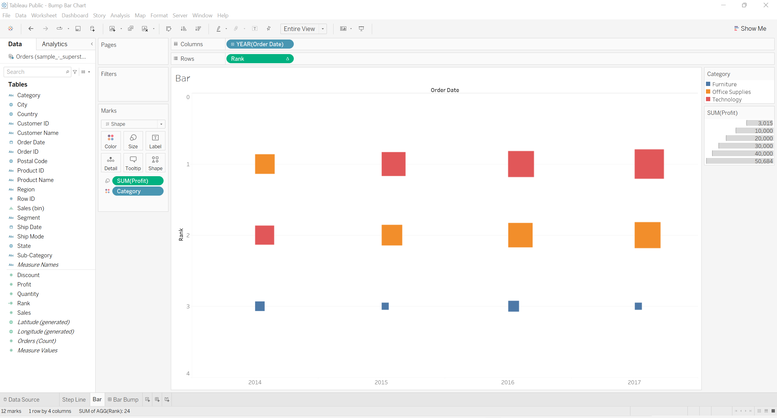
- Download the 2 shapes below onto your PC under My Tableau Repository > Shapes > <Folder>
- 1 is for the bar (note that it is a black rectangle in a transparent background)
- The other is to cover the bar to prevent the height of the bar from being exposed (note that it is a white c-shape in a transparent background)
- Place the pill that represents the duration under Columns
- Place the pill that represents the rank under Rows
- Place the pill that represents the categories into Colour under Marks
- Change the Marks to Shape
- Choose the bar as the shape
- Place the pill that represents the ranked values under Size
Step 3: Create Another Axis for the Ranked "Bar Chart"
- Place the pill that represents the rank under Rows again
- Make it a dual axis by right-clicking on the pill and choosing Dual Axis
- Right-click on the header and click Synchronise Axis
- Change the Marks to Shape again
- Under Shape choose the cover-up
- Right-click on the rank pill to change the Compute Using to the category pill
Step 4: Create a Dashboard
- Place the Ranked "Bar Chart" on the dashboard
- Hide the title and show the dashboard title, if needed
Step 5: Place the Chart onto the Other Chart


